Wayne Equestrian Center
Wayne Equestrian Center
- Date: October 19, 2016
- Categories: Branding, Logos, Promotional
Overview
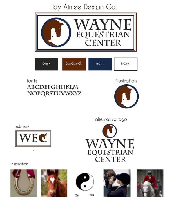
When Kelly Fencl and her partner Cheryl Kindl opened the doors to Wayne Equestrian Center, they wanted to share their deep love, breadth of knowledge and extensive experience in all things equine. With the center’s mission to provide top-notch care and training, the use of the yin and yang concept appropriately represents their focus on developing the skills of the horse and the rider. Additionally, the logo symbolizes the connection and interdependency between the two, both vital to successful horsemanship.
http://www.wayneequestriancenter.com
Scope
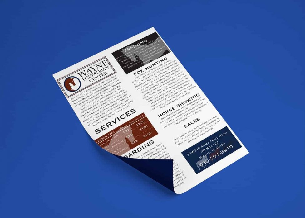
Kelly needed full brand identity package. I created business cards, flyer, banner, web graphics, and sign for her Equestrian Center.
Process
I utilized her love of horses, and a similarity to a " ying and yang symbol. With her extensive knowledge of riding and training them opening her Equestrian center seemed obvious to put her passion to a profession.
Tools
Adobe Illustrator
Adobe Photoshop
Related Portfolio Items
Check out my other portfolio items that you may like!


